Patient-Caregiver Interaction
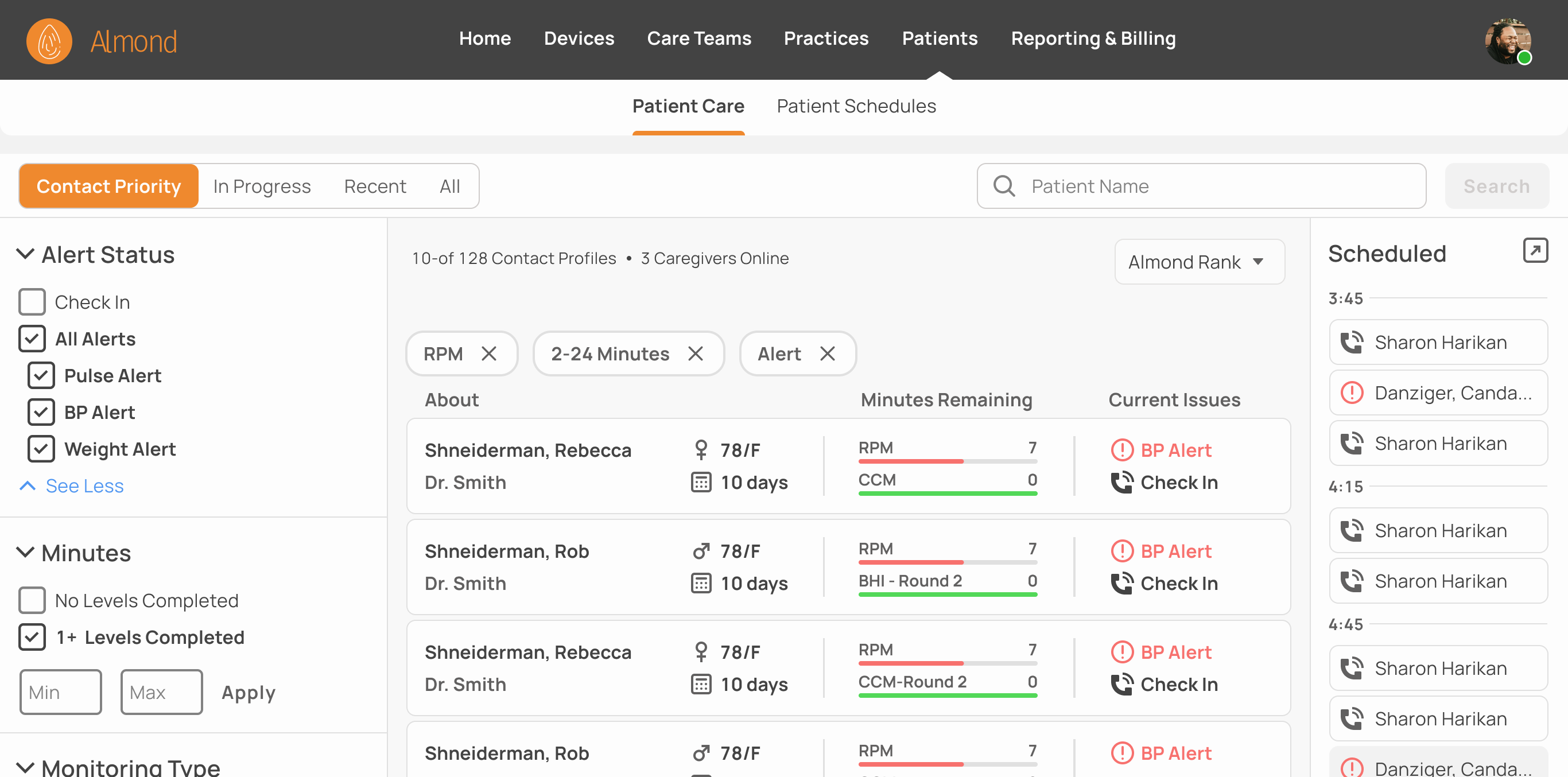
Almond, a remote patient monitoring (RPM) startup, needed a way to organize the stages of patient-caregiver interactions to replace an old system.
Problem
Define the flow and design of patient-caregiver interactions, including how caregivers should prioritize patients to contact, manage in-progress interactions, review past interactions, and look up specific patients.
Solution
Patient cards that are automatically moved between pages dedicated to each stage of patient-caregiver interactions.
Role
(Contractor - sole designer) UI/UX, excluding parts of user flows & research done by Scott Germaise, my incredible PM.
Understanding the Problem
Almond, an early stage startup, partnered with an existing remote patient monitoring practice. Almond’s role was to replace a low-code/no code system which made it difficult for caregivers to prioritize patients.
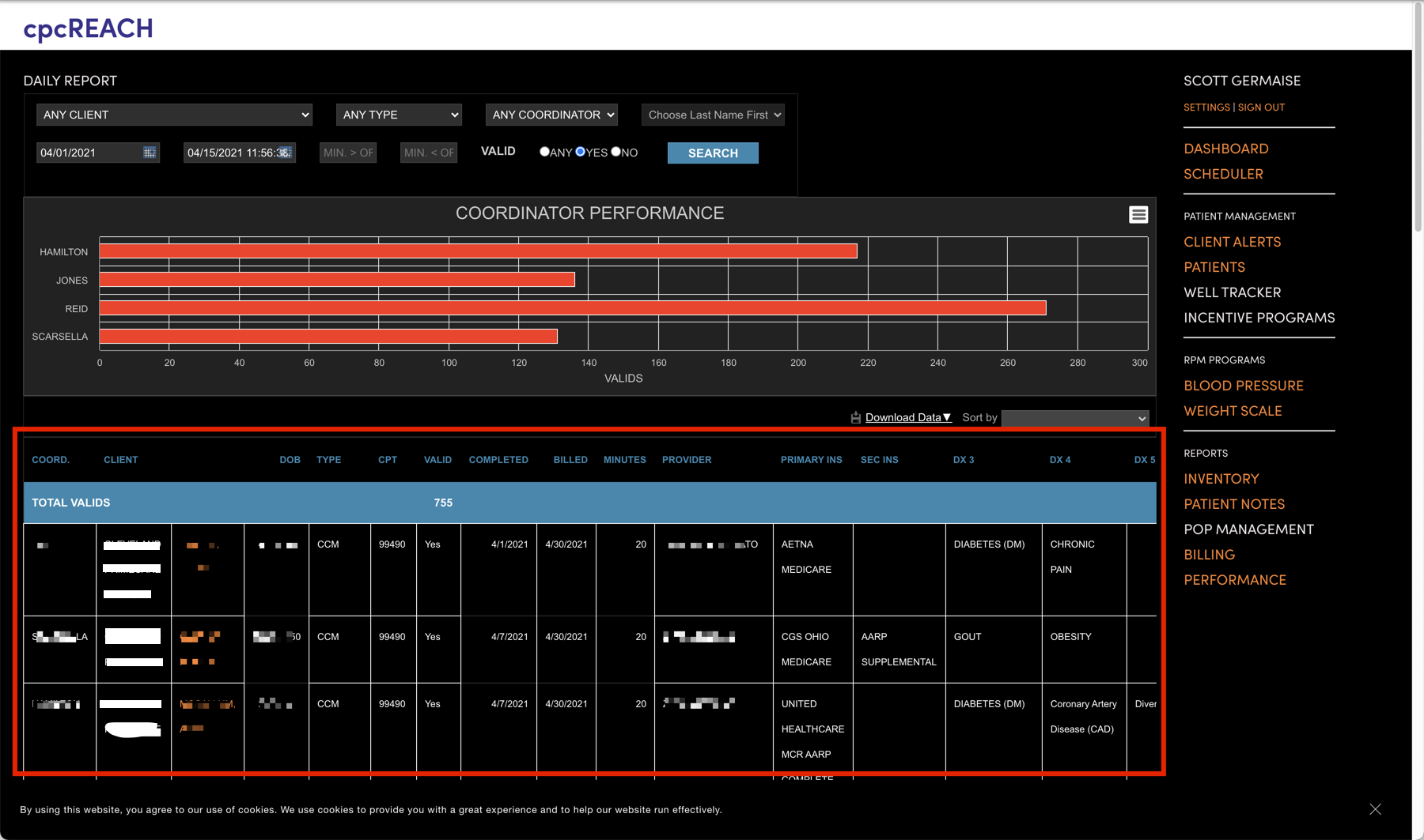
Auditing the Old Dashboard
In the low-code/no code software, caregivers select patients from this list (Redacted).
Issue
There is no triaging. Caregivers scroll through a list of recent vital readings and manually prioritize alerts and other issues. This is inefficient, doesn't scale, and risks overlooking urgent cases.
Between examining the outgoing system, interviewing current RPM caregivers, and looking at competitors’ solutions we came up with the following requirements:
Solution Requirements:
Prioritization of patients based on medical need and billing cycles.
Ability to narrow list of recent vitals with filters and sort features
Ability to search for patients by name
Method to prevent multiple caregivers from clicking on the same file at once
History of recent interactions in event of an audit and for future ML/AI algorithms
Sketching & Wireframing
I sketched out some design ideas by hand and wireframed the most promising ones to discuss with my PM. Considerations included:
Degree of separation between stages of patient-caregiver interaction
Information caregivers need before commiting to a patient file
Designs that could best accommodate future known and unknown features and requirements
Information Needed Before Selecting A Patient
Opening a patient file commits a caregiver to that patient and locks the file to other caregivers. We considered a preview pane to help caregivers decide who to help first without getting locked to that file.
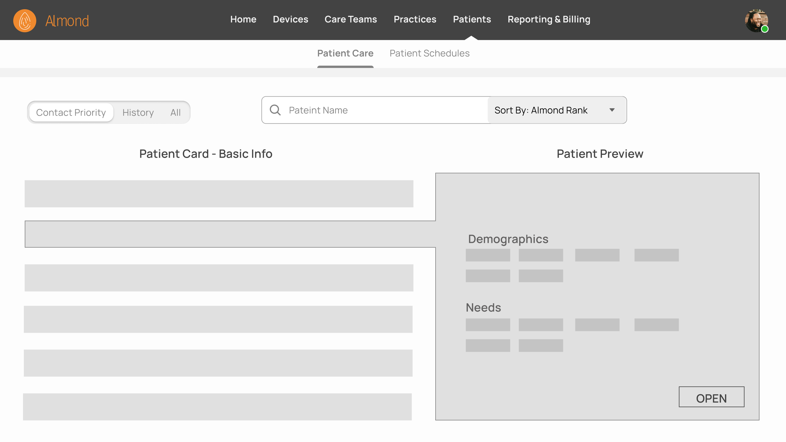
Layout A: Expanded Patient Preview
Clicking on a patient card opens a window with a wealth of information about the patient. From there, caregivers can open the full file or move on without committing to the patient.
Status: Rejected
A patient preview added complexity and took up valuable screen estate.
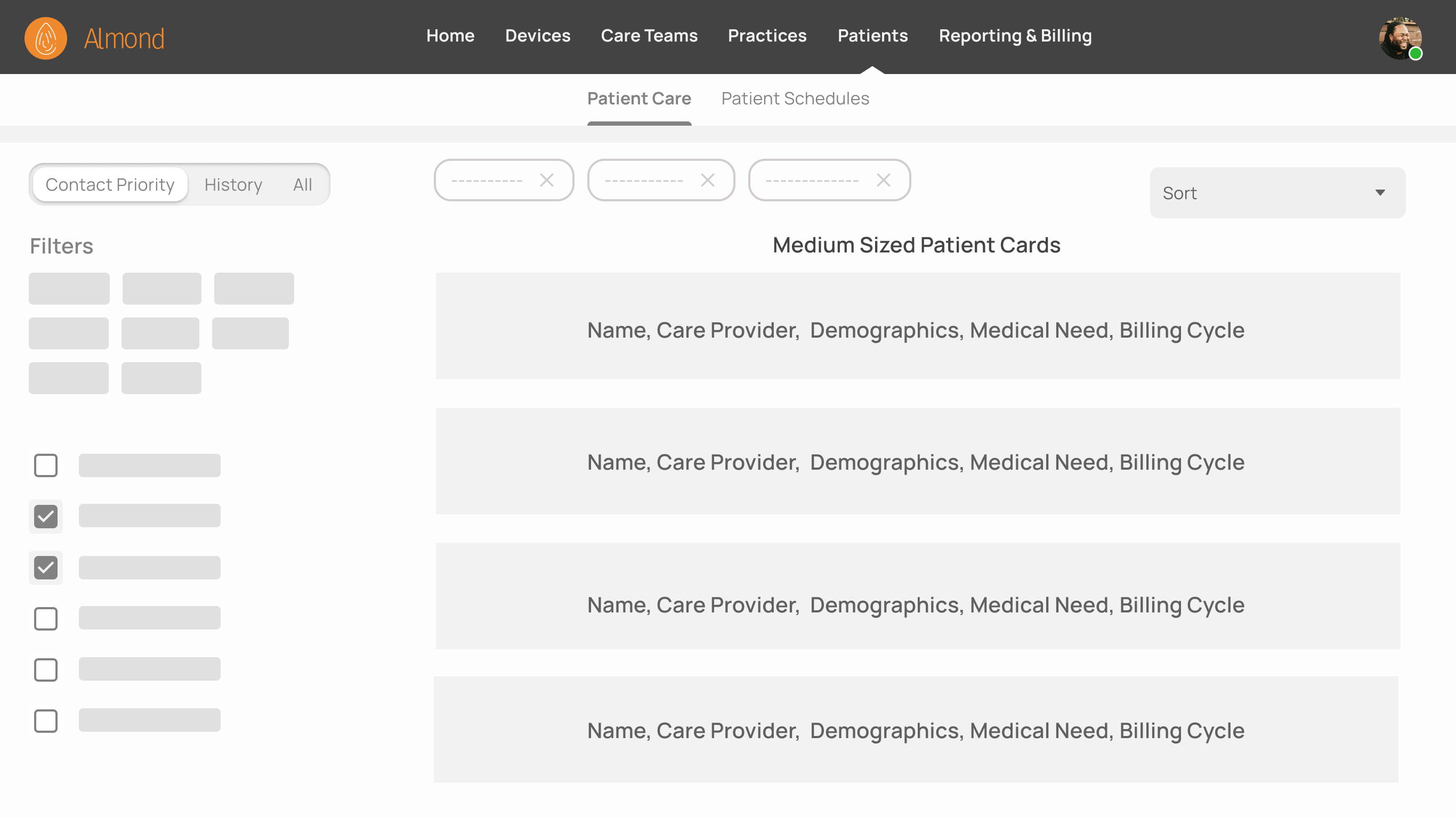
Layout B: Fixed Patient Cards
Clicking on a patient card opens the full patient file directly without a large preview pane.
Status: In Use
Medium sized patient cards proved large enough for general patient information in a smaller, simpler package.
We created a patient card that provides caregivers with a high level overview of the patient and context of their current needs.

This card will move through four tabs on the dashboard throughout all stages of the current patient-caregiver interaction. Each tab is dedicated to dealing with one stage of the interaction.
Tab and Patient Card Progression
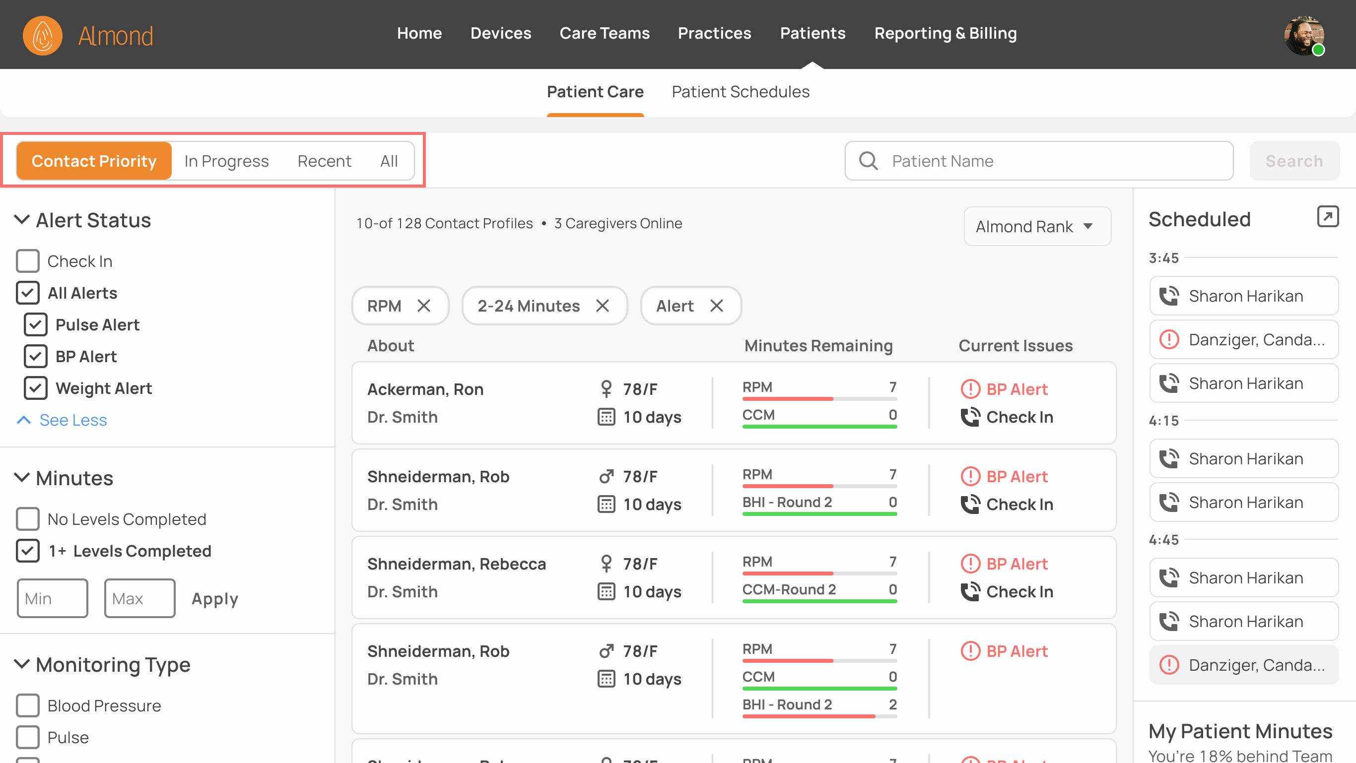
Contact Priority
Main page where caregivers find patients to help. Patented algorithm triages patients based on medical urgency, billing cycle, and time since last contact.
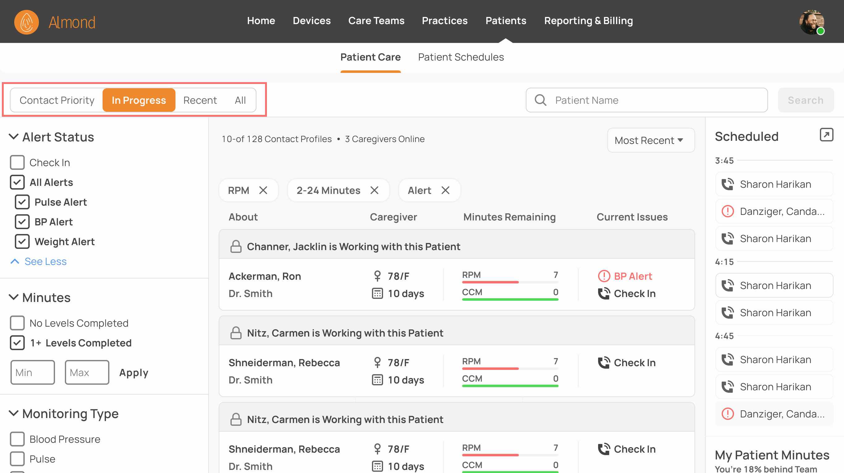
In Progress
Patients currently talking to a caregiver. File is locked to everyone but the current caregiver.
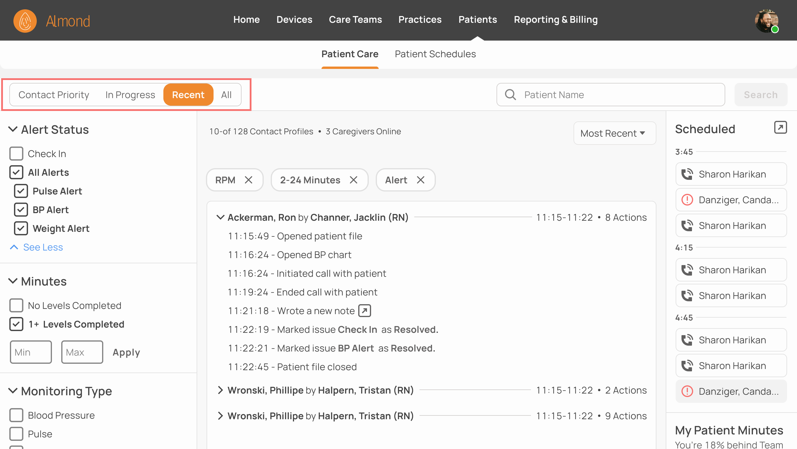
Recent
History of recent interactions.
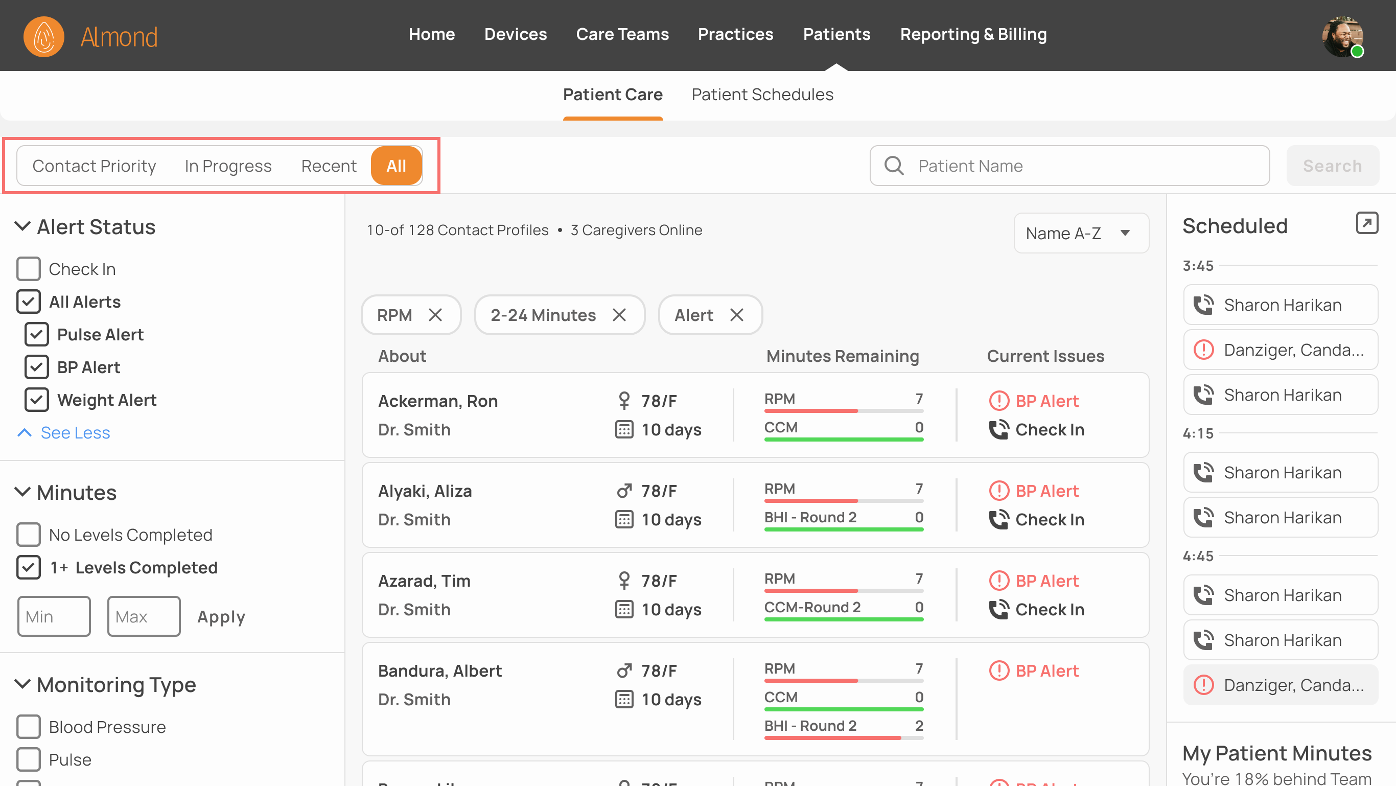
All
A catch-all tab for patients no longer under “Recent” and lists patients regardless of interaction status. Searching for a patient by name defaults to this page.
Visual Design
Designs generally adhere to Material Design guidelines and some components were pulled from a paid material design library and modified to fit our use case. We used an 8-point grid and adopted the font styles and colors of the design library except for the Almond’s orange brand color.
Patient Card Flow
This is the patient-caregiver flow in production. It involves four tabs dedicated to each stage in the process. Here's what that looks like in practice.
1. Contact Priority
Caregiver Jacklin Channer sees patient Ron Ackerman has a BP Alert and is due for a check in. She opens his file.
2. In Progress
While Jacklin has Ron’s file open, it is removed from the list of available patients and moved to “In Progress”. His file is now locked to all other caregivers while she delivers appropriate care.
3. Recent
After Ron has been cared for, a log of Jacklins actions is automatically recorded for medical, regulatory and future AI/ML reasons.
4. All
A week later, Jacklin wants to look up Ron Ackerman but he’s buried behind nine-hundred more recent patients in the “Recent" tab. Instead, she uses the "All tab to search for him alphabetically or by name .”
Observations & Lessons
Dividing the patient-caregiver interaction into stages which patient cards move between granted some clarity to a previously confusing process. However, the short development time and limited user testing that is endemic to early stage startups means there may be some lingering user problems that still need to be flushed out. Some lessons learned include:
Lessons Learned
A definition of done and what constitutes “good enough” for the intended use case can prevent falling down design rabbit holes.
Understanding the problem is most important part of solving it
To present multiple solutions, explain their benefits and drawbacks and explain which I felt best solved the problem and why
Stay ahead of development or they could be forced design it themselves which isn't fair to other team members.
UI/UX is a team activity even on a design team of one. Besides for the enormous contributions of my PM, it’s a collaborative effort with all stakeholders possible, from client through developers.