Patient Details Dashboard
Overview
Almond, a remote patient monitoring (RPM) startup, needed a way for caregivers to view patient detailspage. The solution needs to accommodate the unknown demands of the rapidly evolving RPM field.
Problem
Create a page for caregivers to view patient details that has a low cognitive load despite inherent complexity. The page must be flexible and scalable for unknown future features.
Solution
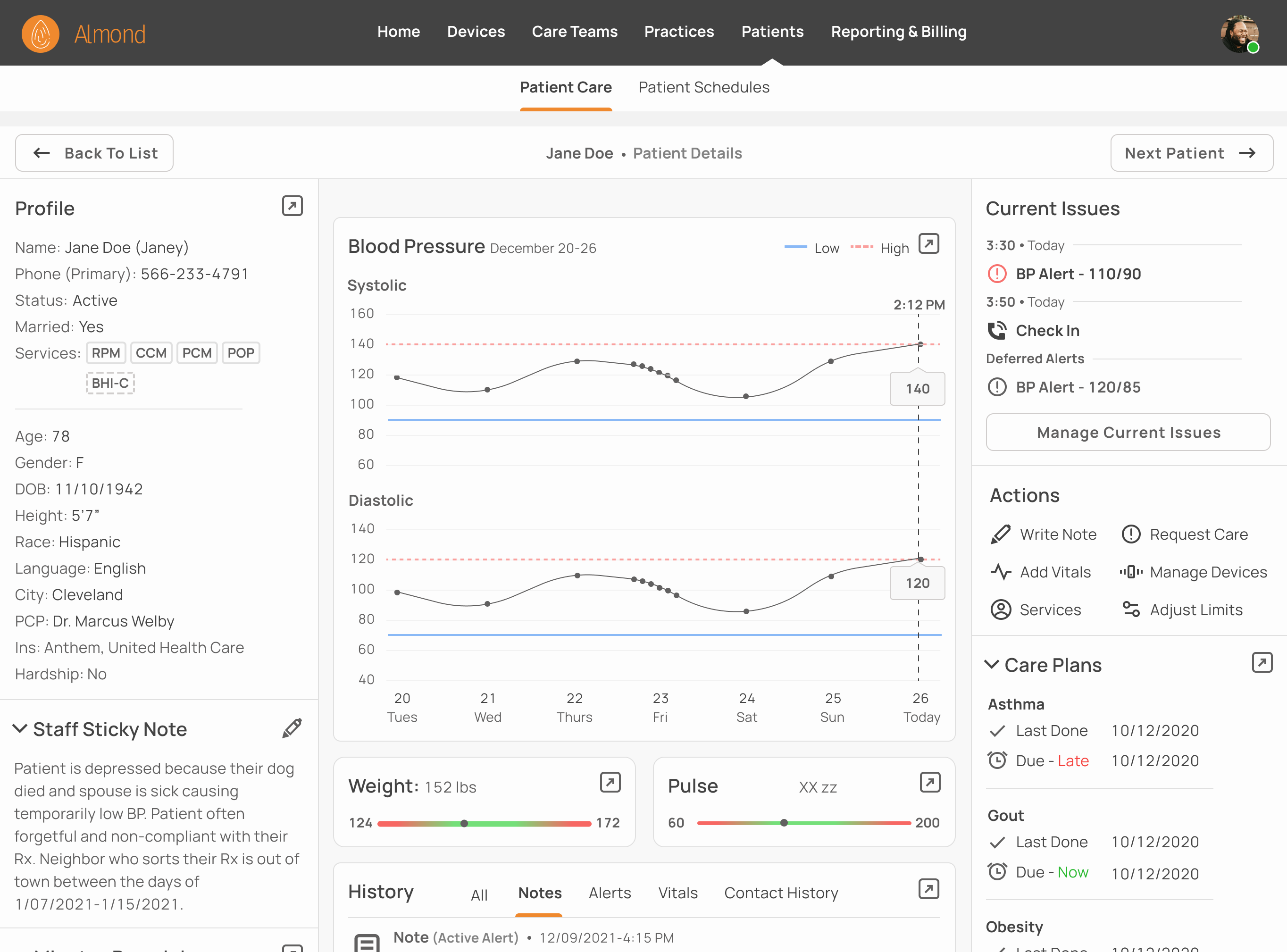
A dashboard which divides summarized content into three sections; static information, dynamic information, and actions. Caregivers can navigate to a dedicated page from each section to explore a topic in depth.
Role
(Contractor - sole designer) UI/UX over a period of two months with credit to my PM, Scott Germaise, for most of the flows and research.
Understanding the Problem
Almond an early stage startup, is building software for caregivers involved in remote patient monitoring (RPM). They partnered with a practice that has a temporary low code/no code MVP which Almond is building a web-based replacement for. The replacement will fix its predecessor's issues and expand its feature set.
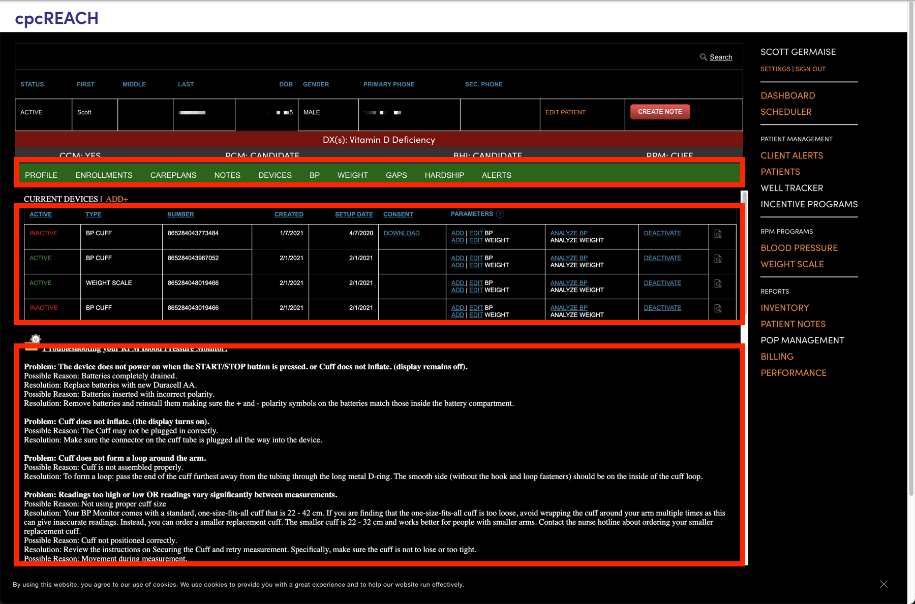
Auditing the Old Patient File
In the low code/no-code software, caregivers learn more about the patient by examining the patient file.
Issue
Poor information architecture. Key decision making items like alerts and graphs are hidden behind multiple clicks (top box) while less important items like device details (middle) and device diagnostics (bottom) are given priority.
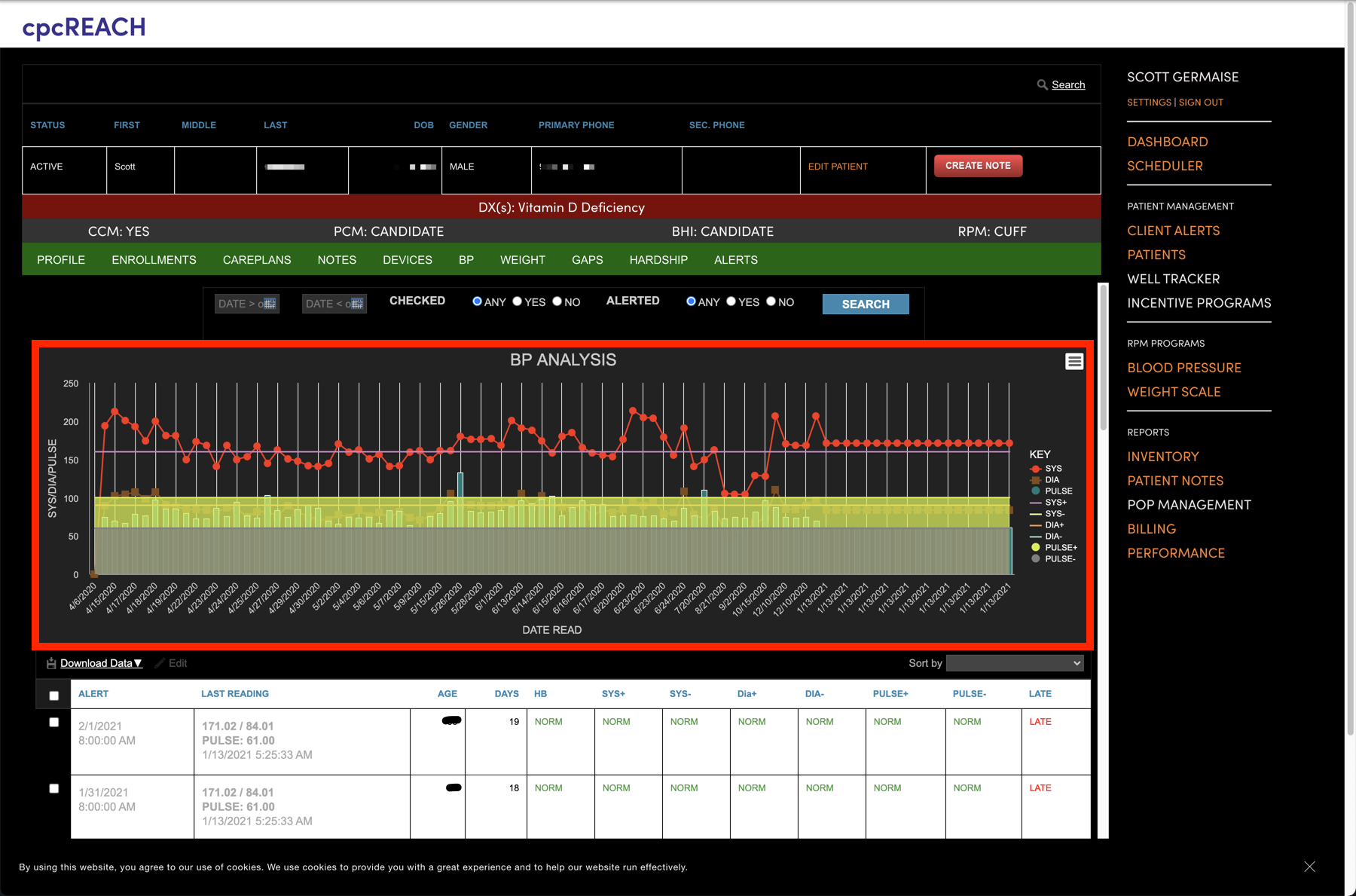
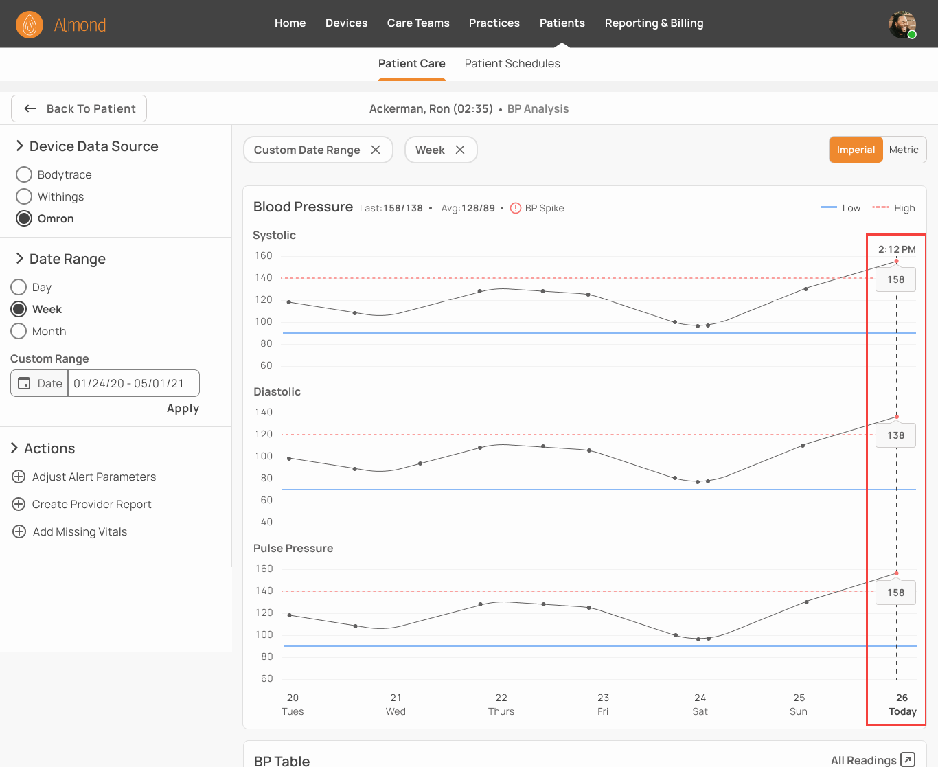
Auditing Patient Graphs
When caregivers need access to key decision making data, they open up dedicated pages like this BP analysis chart (Redacted).
Issue
The graph itself does a poor job of data visualization. Combining systolic, diastolic and pulse readings into one chart makes it difficult to separate individual trends and data points. The yellow bar on hover obscures the parts of the graph it’s supposed to highlight.
Between examining the outgoing system, interviewing current RPM caregivers, and looking at competitors’ solutions we came up with the following requirements:
Solution Requirements:
List all current and past information relating to the patient
Surface frequently used items
Allow caregivers to quickly parse information for items that require attention
Easily accommodate unknown future features
Balancing Data vs. Cognitive Load:
The amount of information in each patient file cut against the requirement that caregivers be able to easily identify areas that need additional attention. A cluttered patient file also makes it harder to place unknown future features.
Interviewing Caregivers
I interviewed two nurses, the lead caregiver of our partners RPM team, along with a M.D. to understand the decision making process that goes into calling a patient. This will decide what items are surfaced.
Key Questions
What caregivers look at first (demographics, cause of current issue, sticky notes)
Whether they need access to multiple items at the same time during a call (generally not but should be easily accessible)
The most commonly performed tasks (calling patients for compliance, dismissing alerts, reading last patient note)
Sketching & Wireframing
We decided to turn the patient file into a patient dashboard which contain summaries instead of an exhaustive list of information that would be hard to navigate. Each summary links to a dedicated page caregivers can open for a deeper analysis.
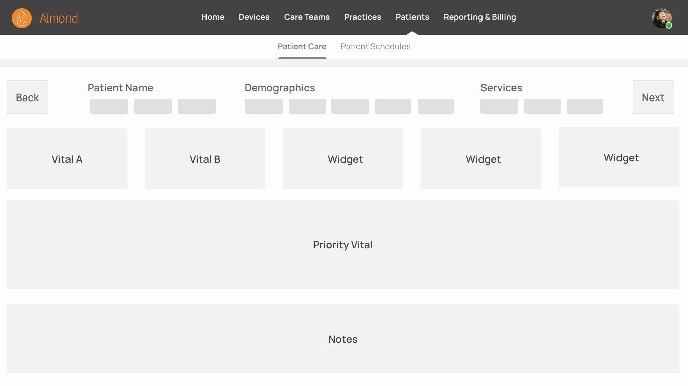
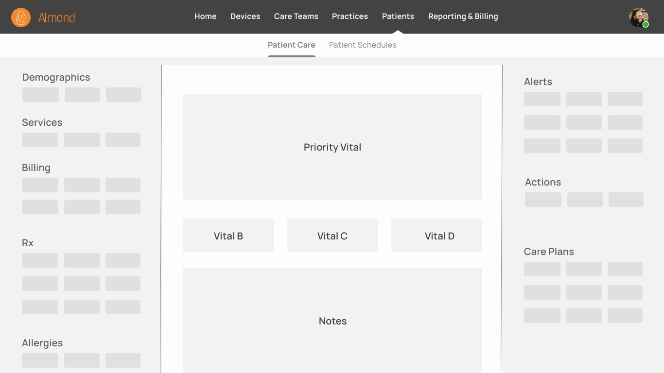
Layout A: Cards
Basic information like demographics which caregivers use to orient themselves are on top. Underneath are widgets that have trends charts or summarized relevant information. The priority vital has a full width chart followed by notes.
Status: Rejected
Lack of card organization makes it likely future features will create card chaos and excessive scrolling. The absence of structure makes item location unpredictable, particularly as the number of cards grows.
Layout B: Mix Panels and Cards
Combine left and right panels with center cards.
Status: In Use
Left-right panels are more space efficient than cards and provide a predictable location for priority information. Center feed highlights graphs and allows for future additional features.
It was important that the design not only be flexible enough to accommodate future features, but also provide a framework for where new features should be placed. Though it’s difficult design for an unknowable future, we thought it likely items would fall into one of three categories:
Items are Either
Static/slow changing. Name and program enrollment vary little day to day.
Dynamic content. Daily vitals and patient notes are constantly updating.
Action items. Examples include alert management and adding new devices.
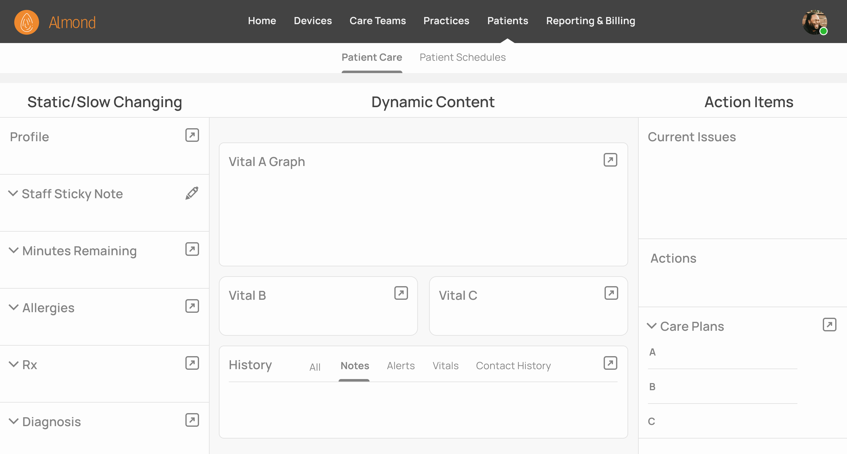
Sections
Dividing the dashboard into sections (slow, dynamic and action) provides a logical placement for existing features and acts as a template for future features.
Groups
Topics were broken down into groups. “Profile, Vital A Graph, Care Plans” are examples of different groups. Each contain just enough information for caregivers to make a decision whether to investigate further.
Visual Design
Designs generally adhere to Material Design guidelines and some components were pulled from a paid material design library and modified to fit our use case. We used an 8-point grid and adopted the font styles and colors of the design library except for the Almond’s orange brand color.
Patient Details In Practice
This is how a caregiver would interact with the patient dashboard in production (based on previous interviews with caregivers).
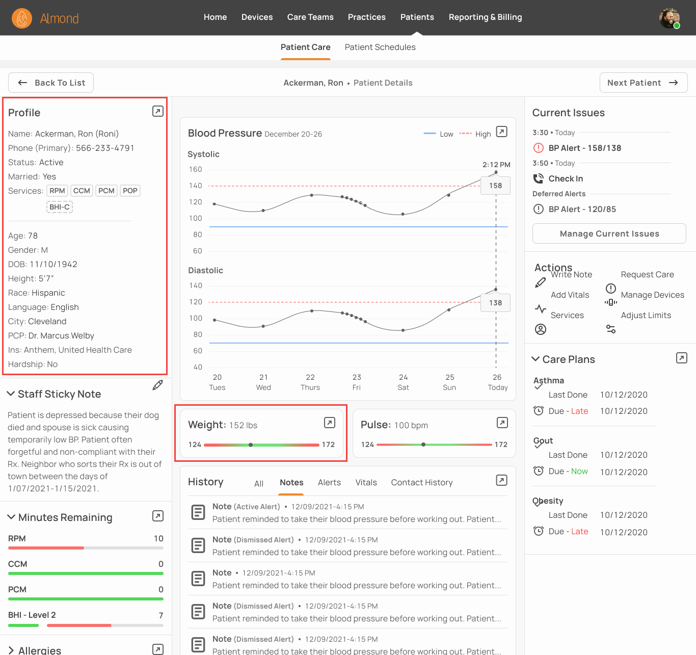
1. Gain Context:
Caregiver Jacklin Channer opened Ron Ackerman’s file because he had a blood pressure (BP) Alert and was due for a check in. Jacklin looks at Ron’s age, gender, height, and weight to add context to the BP Alert.
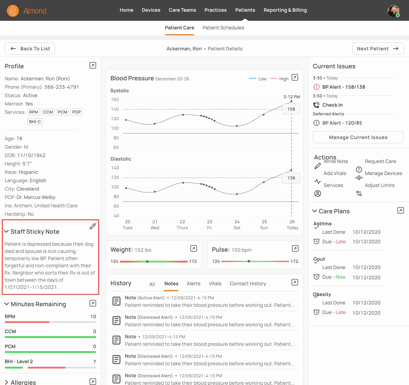
2. Patient Background
Jacklin checks the staff sticky note and sees a previous caregiver wrote Ron has a temporarily low blood pressure making this sudden spike unusual.
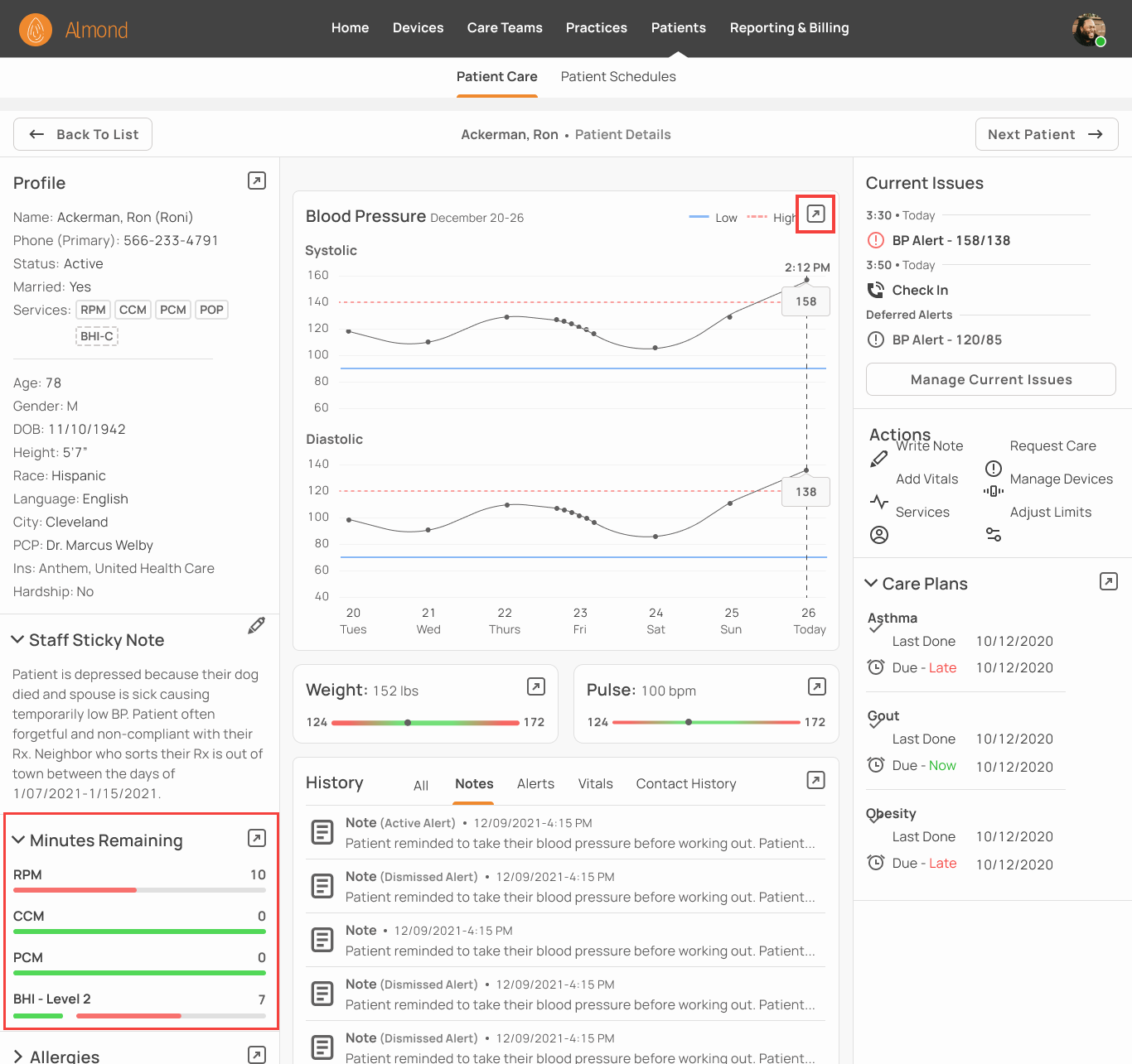
3. Investigate Current Issues
She sees Ron is ten minutes short for the months billing cycle and is owed a caregiver check in. Jacklin next investigates the more important issue of the BP Alert by opening the full blood pressure graph.
4. Contact Patient
Jacklin sees the blood pressure spike is sudden and extreme. She calls Ron and walks him through taking a new reading. As suspected, he’s perfectly healthy and the alert was caused by poor placement of the blood pressure cuff. (See next case study for alert resolution process).
Observations & Lessons Learned
One of the interesting things about designing software for remote patient monitoring is that the field shifts so quickly we are constantly trying to predict an unknowable future. Potential monitoring devices like smart watches are rapidly advancing while regulations that decide billing codes are evolving. This takes place against the backdrop of a world-wide pandemic that has made “remote” a household phrase potentially driving RPM adoption. Besides for replacing temporary low code/no code software, we are also designing for the future. Our decision to turn the list of patient details into a dashboard along with splitting the page into sections should give us enough flexibility to adapt to challenges as they arise.
Lessons Learned
A strong understanding of the problem makes it easier to simplify complexity by removing everything that doesn’t contribute to the solution.
Become an avid follower of design patterns and modify them to fit the context
The confidence to ask questions when I don’t understand something